Welcome to IDEO's blog, your portal into the things we’re making, the ideas we’re kicking around, and the hypotheses we’re testing. From the most ethereal tech experiments in EDGES to the terra firms of business innovation, we invite you to join the conversation.
Our latest articles


Our favorite series
.jpeg)
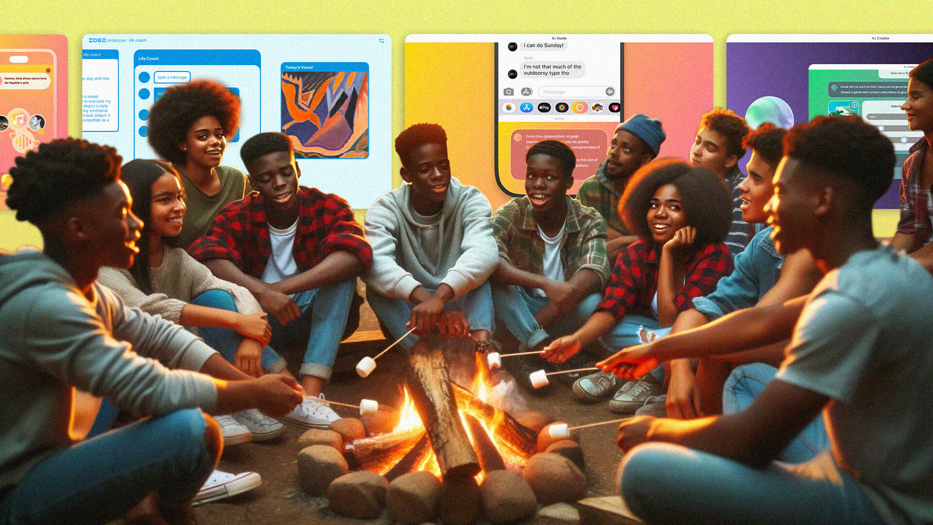
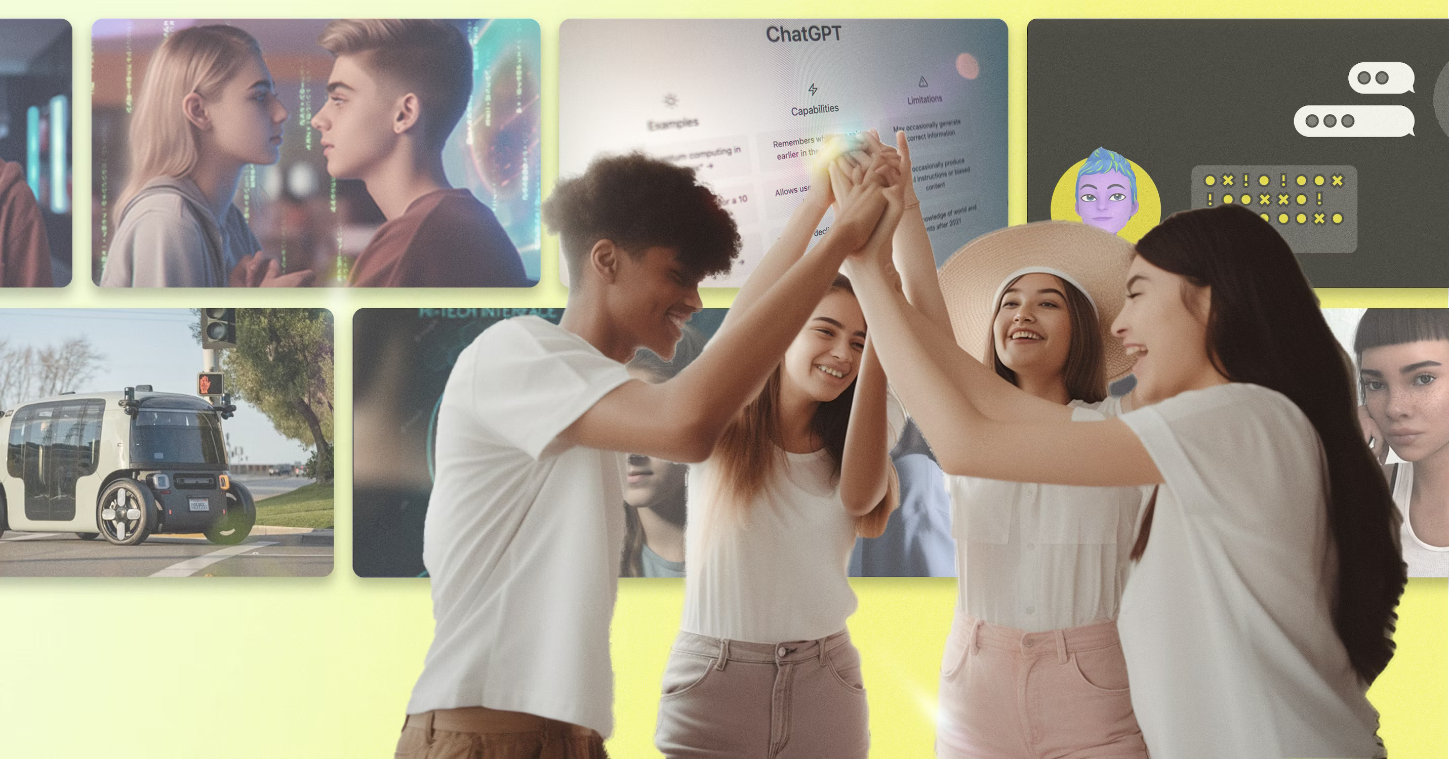
Gen Z + AI
Is Gen Z Ready to Embrace AI? It’s Complicated.
Lessons from young people on AI’s thin line between productivity and interference.

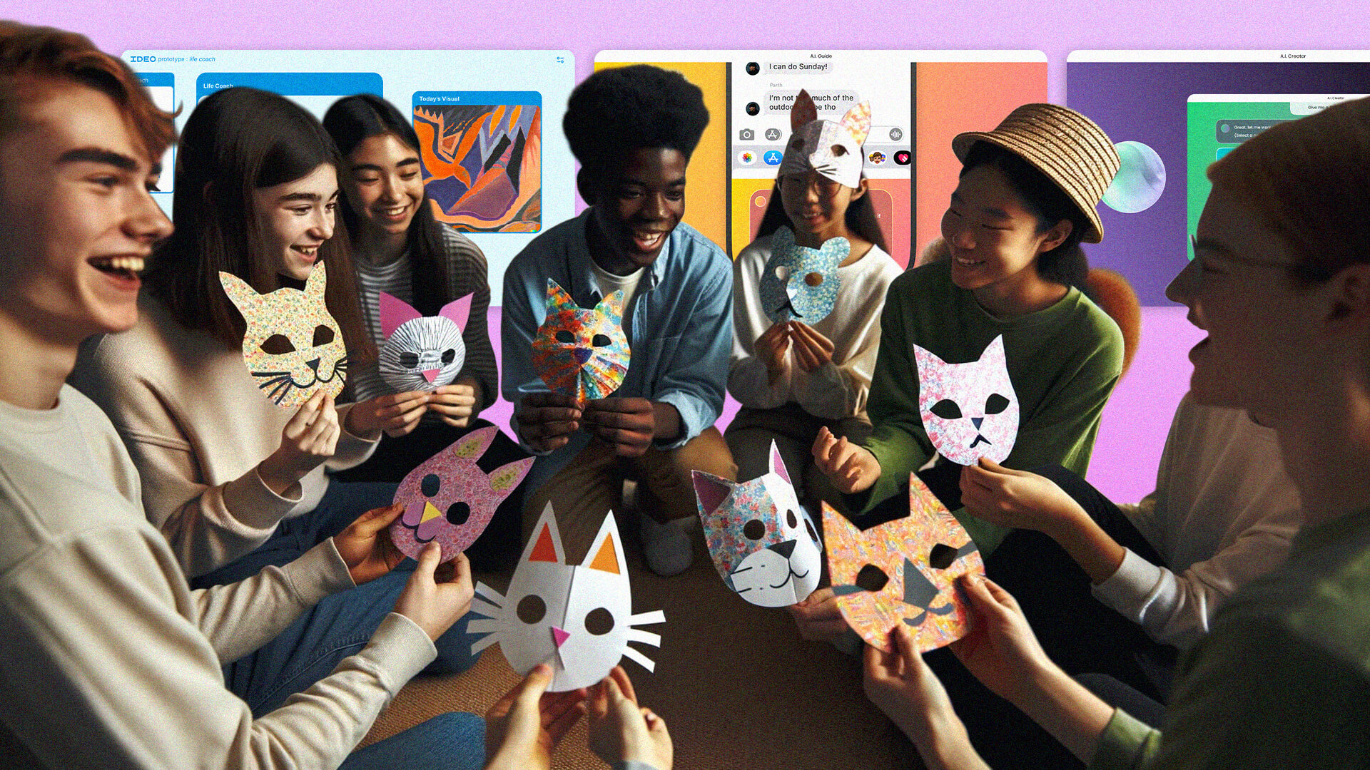
Gen Z + AI
Gen Z to AI: Don’t Kill My Creative Vibe
3 Principles to design AI creative tools Gen Zs will actually want to use.
Gen Z + AI
Will AI Interfere with Relationships? Gen Z Thinks So.
Forget bots. Young people want to augment human relationships.

Stretch
The Illusion of Knowing Everything
To understand people’s needs, we must stretch beyond data.

Stretch
How AI Can Help Us Solve the Climate Crisis
From talking jeans to Nature boardrooms, we’re stretching to meet the future.

Stretch
Can Failure Be and Feel Productive?
It doesn’t pay to cling to a bad idea.

Net-Zero
“You’ve Just Got to Get Started”
The conversation that fueled IDEO’s path towards Net Zero

Net-Zero
Our First Step Toward Net Zero: Estimating IDEO's Carbon Footprint
The imperfect science of carbon emissions accounting. Learn more from IDEO and how your company can get started too.

Net-Zero
Removing IDEO’s Emissions With Voluntary Carbon Offsets
“Genuine question: are offsets a useful thing?”
.jpg)
Subscribe to the IDEO Newsletter
Oops! Something went wrong while submitting the form.